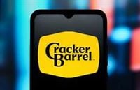
Cracker Barrel, the beloved Southern-themed restaurant chain founded in Lebanon, Tennessee in 1969, found itself at the center of a national firestorm this August after unveiling a new, minimalist text-only logo. The redesign, which removed the iconic image of a man resting on a barrel—affectionately known as the “Old Timer”—was intended as part of a broader campaign to modernize the brand and attract younger diners. But what followed was a cascade of backlash, not just from loyal customers in its hometown, but from political figures, social media influencers, and branding experts across the country.
The logo, originally designed in 1977 by Bill Holley, is more than just a visual marker for Cracker Barrel; for many, it’s a symbol of nostalgia, comfort, and Americana. According to Fox Business, the company’s attempt to switch to a plain text logo—its first major change in nearly half a century—was met with immediate disapproval in Lebanon. Yolanda Morrow, a frequent diner, summed up local sentiment: “If something’s not broke, don’t fix it. … I’m glad it’s gone back.” Her husband, Eddy, echoed that relief, admitting he was “glad everybody rebelled like they did.”
The sentiment was widespread. Gary Love, another customer, pointed out, “That’s what makes this place what it is. It’s an old country store.” Susie Morgan, speaking to Fox Business, added, “I don’t think they need to change anything about it because I love it the way it is. Everybody’s got used to it like it is, and it’s just great because you’ve got all your memories when you come to it and everything.” Rodney Burlin, who lives near the original Cracker Barrel location, argued that the logo is a symbol of home-style cooking and comfort, even for out-of-state visitors. “For them to be making changes like that, it didn’t need to be changed.”
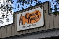
But the reaction wasn’t just confined to Tennessee. As The Washington Post reported, the wife of the late Bill Holley, Beverly Holley, weighed in, saying, “He would not have liked the plain Jane logo, because it really says nothing about the restaurant.” She also shared a lighter note: “I think Bill’s holding his hand up and saying, ‘I made Cracker Barrel great again!’” The original logo, she revealed, was sketched on a napkin during a meeting with the restaurant’s founder, Dan Evins. The man in the logo was based on Evins’ Uncle Herschel—a personal touch that, for decades, helped define the chain’s identity.
The new logo’s unveiling quickly spiraled into a political issue. According to The Independent, conservative voices on social media labeled the rebrand as “woke.” Influencer Benny Johnson accused CEO Julie Felss Masino of “destroying a great American brand,” while activist Chris Rufo called for a campaign to “break the Barrel,” arguing, “It’s not about this particular restaurant chain – who cares – but about creating massive pressure against companies that are considering any move that might appear to be ‘wokification.’” Even former President Donald Trump jumped into the fray, posting on Truth Social and urging Cracker Barrel to revert to the old logo. “Congratulations ‘Cracker Barrel’ on changing your logo back to what it was. All of your fans very much appreciate it. Good luck into the future. Make lots of money and, most importantly, make your customers happy again!” he wrote.
The backlash wasn’t just digital. According to PRWeek, mentions of Cracker Barrel surged from 350 on August 18 to a staggering 1.6 million by August 27, with nearly half a million focused specifically on the logo or rebrand. A significant portion of this conversation—over 424,000 mentions—pulled Cracker Barrel into culture-war debates, using terms like “woke” and “un-American,” while 40,000 posts called for boycotts. CEO Julie Felss Masino, who had launched a transformation project a year earlier to address stagnating sales, was personally targeted in 138,000 mentions as a “woke DEI CEO.”
The company’s response was swift. On August 26, 2025, Cracker Barrel announced it would scrap the new logo and restore the Old Timer. “We thank our guests for sharing your voices and love for Cracker Barrel,” the company said on X. “We said we would listen, and we have. Our new logo is going away and our ‘Old Timer’ will remain.” This rare public admission of a branding mistake, as marketing professor Kimberly Whitler told Marketplace, is almost unheard of in corporate America. “The CEO literally admitted they made a mistake. That is rare,” Whitler said.
Branding experts see the episode as a cautionary tale for companies navigating today’s politically charged environment. Greg Hahn, founder of branding agency Gretel, told PRWeek that certain logos—like Coca-Cola’s—are so deeply embedded in culture that changing them is almost unthinkable. “That’s one you couldn’t pay me to change,” he said. While Cracker Barrel’s logo might not be quite as globally iconic, its removal was seen as a betrayal by many of its core customers. Jason Schlossberg, CEO of ReadyMade Company, observed, “What was once design criticism has become ideological warfare.”
The Cracker Barrel saga fits a broader trend where brand decisions are quickly politicized, especially when they run counter to the perceived values of their core audience. Nick Loui, CEO of PeakMetrics, noted, “When the company rolled out a minimalist logo redesign, it wasn’t simply viewed as a creative refresh—it was quickly interpreted as a signal the brand was ‘going woke’ or abandoning tradition.” Even so, some observers argued the controversy was overblown, manufactured by political actors eager to seize on a branding decision to distract from larger issues.
For Cracker Barrel, the reversal may ultimately prove beneficial. Tim Calkins, a marketing professor at Northwestern, suggested that by listening to feedback and restoring the Old Timer, the company addressed much of the concern. “We are thinking more about Cracker Barrel than I think we’ve thought about Cracker Barrel in a very, very long time,” he told Marketplace. In today’s attention economy, that kind of visibility is invaluable—if a bit nerve-wracking for those in the boardroom.
Still, the company’s broader transformation isn’t over. Experts expect Cracker Barrel to continue updating its menu and dining room design, even as it holds onto the visual touchstone that connects it to its roots. The lesson, as Sadie Dyer of Siegel+Gale observed, is the importance of bringing loyal customers along on the journey and explaining the rationale behind changes. “The new logo removed a lot of elements, so were they doing that to show up better in digital formats? Or on a crowded highway sign with eight other restaurant brands?” she asked. “Instead, the logo change came off as a signal that they only wanted to appeal to new audiences, and that touched a nerve.”
For now, the Old Timer remains, a reminder that in a world where brands are often caught in the crosshairs of cultural and political battles, sometimes the safest path forward is to honor the past while carefully plotting the future.