The selections for the color of the year for 2025 signal significant trends as consumers increasingly seek to create sleep sanctuaries within their homes. Luxury colors and muted tones dominate this year’s choices, indicating a shift from the light and bright hues prevalent just last year. Amidst societal changes and emotional turmoil, these trends reflect a collective need for tranquility and comfort.
According to Hallie Spradlin, director of visionary at FS, "Everything we do at FS is tied to larger cultural movements, consumer sentiments, and behavior." This sentiment has guided color choices for the upcoming year, mirroring how consumer preferences evolve over time. Last year, vibrant colors like Pantone's Peach Fuzz 13-1023 and Valspar's Renew Blue 8003-37D were en vogue, embodying optimism and energy after the challenges of the pandemic. But as Joana Walker, a Milan-based fashion expert, notes, “Bright hues symbolized hope and a craving for emotional rebirth.”
Now, the focus has shifted. Spradlin highlights how subdued colors are rising to the forefront to address the current longing for "tranquility, grounding, psychological comfort, and mental clarity." The muted palettes aim to create environments conducive to relaxation and reflection, with relationships expert Jonathan Hartley noting, "The attraction to muted colors reflects our collective need for emotional decompression.”
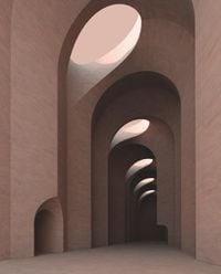
The luxury bedding market is capitalizing on these trends, with the idea of creating serene, restful spaces gaining traction. This year’s color offerings include Pantone 17-1230 Mocha Mousse, recognized as the color of the year by the renowned color standards company. This rich brown shade, as described by Pantone, "nurtures with its suggestion of the delectable quality of cacao, chocolate, and coffee, appealing to our desire for comfort." Leatrice Wiseman, executive director of the Pantone Color Institute, elaborates, saying the hue “extends our perceptions of the browns from being humble and grounded to embrace aspirational and luxe.”
Self-care remains at the heart of today's consumer decisions with bedding representing the one place where individuals can truly recharge. Notably, research from the Better Sleep Council reveals practical reasons behind mattress purchasing decisions. Consumers are driven by low prices and reputable brands, as two-thirds report their current mattress is different from their previous one. This trend presents opportunities for manufacturers to capture new clientele by introducing value-driven lines.
Briny Hues emerged as another influential trend, encapsulating the mood of consumers seeking comfort through evocative colors. Spradlin characterizes the color as something enriching, “encouraging us to relish fleeting moments, whether indulging in a caramelized dessert or savoring the first sip of our favorite beverage.” Other companies echo this sentiment; for example, Graham & Brown selected Elderton—deeply inspired by the elder tree—as their color of the year. Paul Taylor, head stylist at Graham & Brown, describes the color as having “a huge amount of depth, reconnecting us with nature.”
Notably, Lowe’s Stainmaster brand has also joined the trend with their darker brown selection, Truffle. Meanwhile, Little Greene named Mochi (344) as their modern neutral for 2025, reflecting earthy elegance and warmth.
Colors like purple are gaining traction reflective of psychological comfort. FS has forecasted Softly Bruised, capturing hues drawn from healing processes, speaking to the raw intensity of societal upheaval. Benjamin Moore’s Cinnamon Slate 2113-40 neatly embodies this color shift, identifying itself as possessing “modern sensibility.” Similarly, Glidden’s color of the year, Purple Basil PPG1046-7, embodies self-expression and the rise of maximalism across design industries.
According to Behr's 2025 color of the year, Rumors MQ1-15, research reveals compelling interest; 84% of respondents noted how red catches attention, and 70% felt these hues brought elegance to their spaces. This affinity for red makes it especially appealing for bedroom renovations.
Colors like deep crimson not only signify sophistication but also hint at feelings of passion and warmth, aligning with consumer tendencies for cozy, inviting collectives within their homes. C2 Paint has chosen Raku—a nuanced deep purplish hue named after traditional Japanese pottery for tea ceremonies—as another example of how color trends reflect the meditative experiences sought by today’s consumers.
The trend emphasizes the importance of connecting with nature through earthy and grounded tones. HGTV, by Sherwin-Williams, introduced Quietude SW 6212, linking its soft green to the need for tranquility and mindfulness within one’s space. Meanwhile, Dutch Boy Paints showcased Mapped Blue 429-5DB, reflecting shifting values, especially among millennials and Generation Z who prioritize products with durability and timeless designs.
Valspar has taken growth leaps with their selection, Encore 8002-45G, showcasing dramatic, modern tones made for consumers ready to innovate their interiors. Insights are clear; integrating consumer sentiments with trending colors can help brands attract and retain customers.
Now, more than ever, the emphasis is on creating individual sanctuaries within the home. Exploring the 2025 color trends reveals the industry's responsiveness to consumer demands for luxurious yet calming environments. With these offerings, brands long-established or new are poised to meet the emotional and aesthetic desires guiding purchases moving forward.